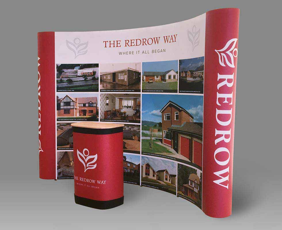
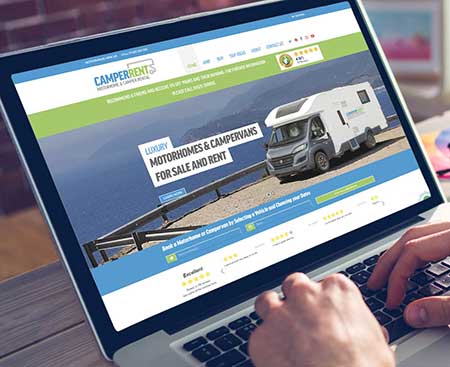
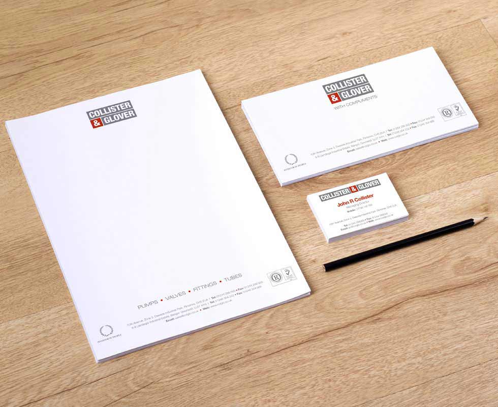
The colour of your brand is something that is often taken for granted when viewing a logo. But if we start to dig a little deeper we discover the colour of your brand plays a huge part in how customers feel about your company.
It’s important to understand that different colours invoke different emotions for the customer. It is no accident that fast food chains predominantly utilise red and orange for their brand identities as these colours portray the feeling of warmth and speed In a similar vein, technology companies tend to rely on blue and grey as these convey a feeling of intelligence and dependability. Studies have shown that colour influences around 60 to 80 percent of a customers purchasing decisions, this means that the colours utilised in your branding can literally make or break your company.
What the colour of your logo means
Red – Confidence | Warmth | Volume
Blue – Dependable | Trustworthy | Forward-thinking
Green – Peaceful | Healing | Protective
Black – Luxurious | Modern | Experienced
Yellow – Sunny | Playful | Affordable
Purple – Creative | Different | Spiritual
Some companies go as far as ‘owning’ a colour, it’s hard to think of Coca Cola in any other colour context than red or Harrods in anything other than green. This can give a company a massive competitive edge in the marketplace and provide an amazing shock tactic when the logo colour is changed for a particular one off campaign. Owning a colour is not something that happens overnight, it takes years of skilful application across all elements of your marketing.
So, I’ve put together a list of 10 brands that have done just that…
1. Harrods – Green
2. Coke – Red
3. Facebook – Blue
4. Apple – White
5. Cadburys – Purple
6. Renault – Yellow
7. Guinness – Black
8. Easyjet – Orange
9. Heinz – Aqua
10. Barbie – Pink
If you are a business start-up looking for a new logo design or an existing company looking for a refresh, speak to us today and we will be happy to help you out.
