

What Makes People Stop at an Exhibition Stand?
Most visitors at a trade show will walk past your stand. That’s not pessimism – it’s physics. A busy show floor is sensory overload: competing graphics, noise, movement, and hundreds of businesses all trying to catch the same pair of eyes at the same moment.
So what actually makes someone slow down, change course, and step into your space?
It turns out there’s quite a lot of science behind it.
The three-second rule
Research into exhibition behaviour consistently points to the same window: you have roughly three seconds to register with a passing visitor before they’ve mentally filed you under “not relevant” and moved on. In that window, they’re not reading your copy. They’re not processing your bullet points. They’re reacting to shape, colour, scale and movement – in that order.
This is why the businesses that obsess over fonts and paragraph text on their stand panels are often the ones wondering why nobody stopped. The brain doesn’t read first. It sees first.
Colour and contrast do the heavy lifting
The most powerful tool on any stand is contrast. Not just colour contrast – though that matters enormously – but contrast against the surrounding environment.
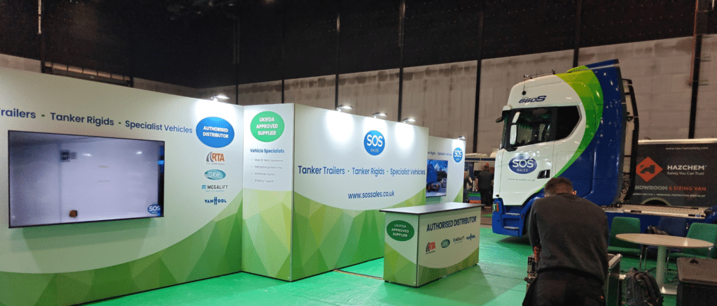
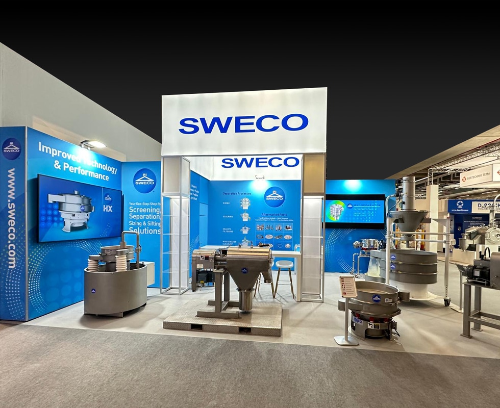
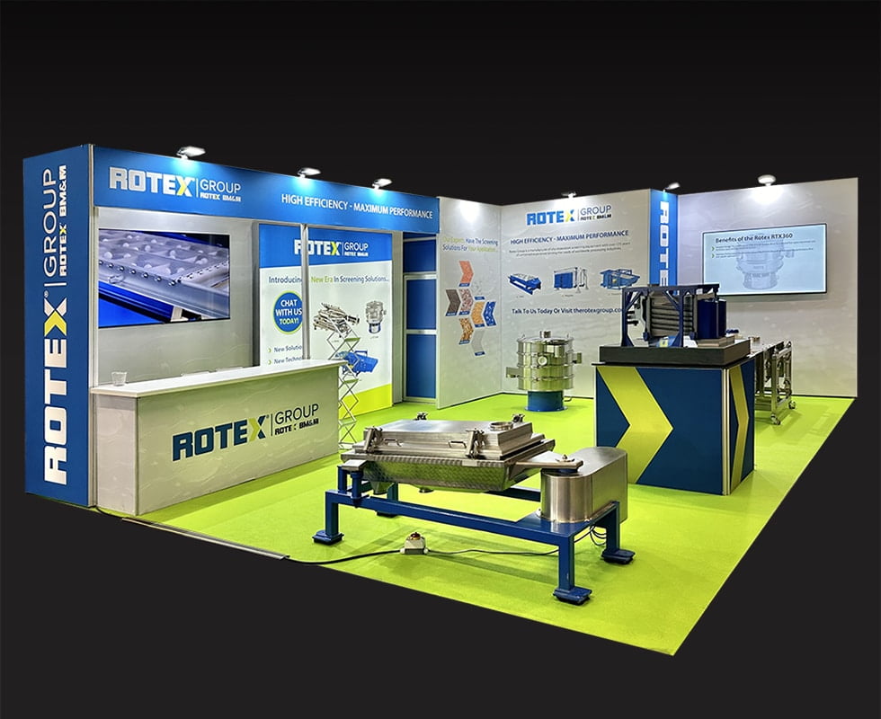
At this year’s UKIFDA Show, the SOS Sales stand used a bold white-to-green gradient across a large curved backwall. In a hall where a lot of stands default to dark or neutral tones, that brightness creates a visual anchor. Your eye finds it and holds it, even from a distance. That’s not accidental – it’s the first job of stand design working exactly as intended.
Colour also carries meaning before a word is read. Green reads as environmental, modern, forward-thinking. White reads as clean, precise, trustworthy. Both are useful signals for a business selling specialist tanker vehicles to fuel distribution professionals.
Scale signals credibility
There’s a reason the biggest stands at any show attract the biggest crowds, even when the products on display aren’t objectively more interesting than those on a smaller stand nearby. Scale communicates investment, and investment communicates confidence.
You don’t need a 10×10 metre space to benefit from this psychology. What you need is at least one element on your stand that reads at a distance – something that registers from 15 or 20 metres away rather than only becoming clear when someone is already standing in front of you.
For SOS Sales at UKIFDA, that element was a full-size liveried truck positioned alongside the stand. It’s almost impossible to miss, it communicates the product category instantly, and it gives passing visitors something to orient around. A large-format screen on the opposite side reinforced the same effect – two visual anchors working together to create a stand you notice before you reach it.
The entry point problem
One of the most overlooked elements of stand design is the entry point – or more accurately, whether there is one.
Stands with desks or counters positioned across the front create an unconscious barrier. Visitors read it as “you have to engage with someone to come in here” and a significant proportion will avoid that friction entirely, even if they’re genuinely interested. It’s the same reason people will walk past a shop if a sales assistant is standing directly in the doorway.
The most effective stand layouts create a clear, open invitation to step in. The desk or counter exists, but it’s positioned to the side or rear – somewhere a conversation can happen naturally once someone has already committed to being in the space.
Hierarchy: what the eye reads and in what order
Visual hierarchy is the order in which the eye processes information on your stand, and it follows predictable rules. Largest first. Brightest next. Then movement. Then text – and only at close range.
This means your stand headline needs to work at scale. Single-syllable impact, not a paragraph. “Tanker Trailers. Tanker Rigids. Specialist Vehicles.” – the copy running across the SOS Sales backwall at UKIFDA – is a good example of this done well. It’s not clever or poetic. It tells you exactly what the business does in the time it takes to walk three metres.
Sub-hierarchy – partner logos, accreditations, supporting copy – belongs in the middle distance. It’s for visitors who have already been captured and are now looking for reasons to engage further. The UKIFDA Approved Supplier badge and the RTA, GRW, Megalift and Van Hool partner logos serve exactly this function. They reward closer inspection without cluttering the primary view.
Why people actually stop
Strip away all the design theory and the honest answer is this: people stop because something made them curious, and curiosity is triggered by the unexpected.
A truck in the middle of a hall is unexpected. A screen playing real footage of equipment in action is unexpected. A stand that’s noticeably brighter or more spacious or more visually coherent than the ones around it is unexpected.
Curiosity creates a pause. The pause creates a conversation. The conversation is where the real value of any trade show actually lives.
The takeaway
If you’re planning your next exhibition design, the questions worth asking before you think about furniture or giveaways or stand dressing are these: What will make my stand register from 20 metres away? What is the single thing that communicates what we do before anyone reads a word? And is there a genuine reason for someone to stop, rather than just pass by politely?
Get those three things right and the rest of the work becomes considerably easier.