
When it comes to logo design, there’s more to a successful brand mark than aesthetics. A great logo leads the eye, creates structure, and tells a story – all within a few seconds. That’s where logo design hierarchy comes in.
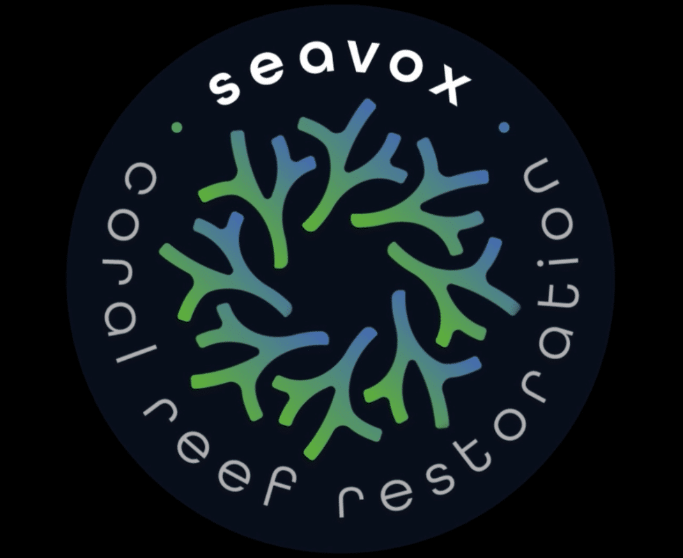
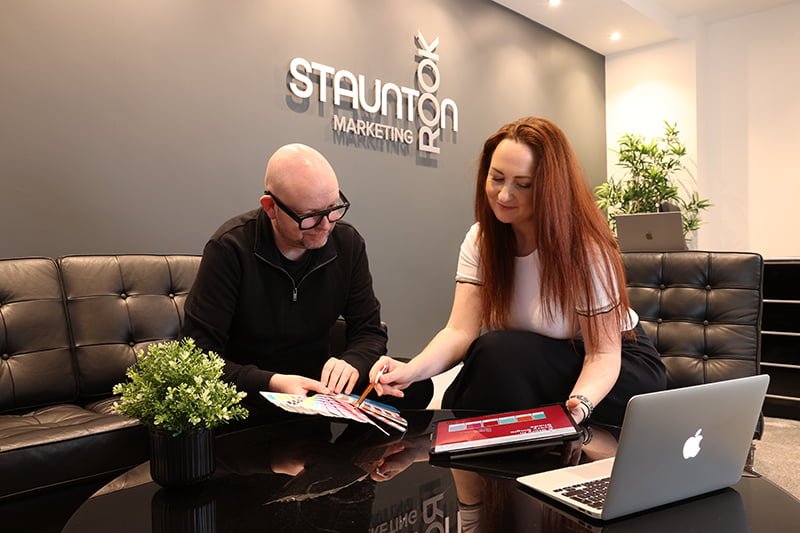
At Staunton Rook, we recently worked with Seavox, a marine conservation brand focused on coral reef restoration, to create a new logo that reflects their mission. The result is a clean, memorable hierarchy logo that captures both their purpose and identity – and it all started with structure.
What Is Logo Design Hierarchy?
Visual hierarchy in logo design is the intentional arrangement of elements to guide how a viewer sees and understands your logo. It uses size, positioning, colour, contrast, and shape to control what grabs attention first – and where the eye goes next.
Think of it like storytelling through design:
- What do you want someone to notice first?
- What should they feel or understand immediately?
- How do you guide them from the brand name to the core message?
How We Applied Logo Hierarchy in the Seavox Logo
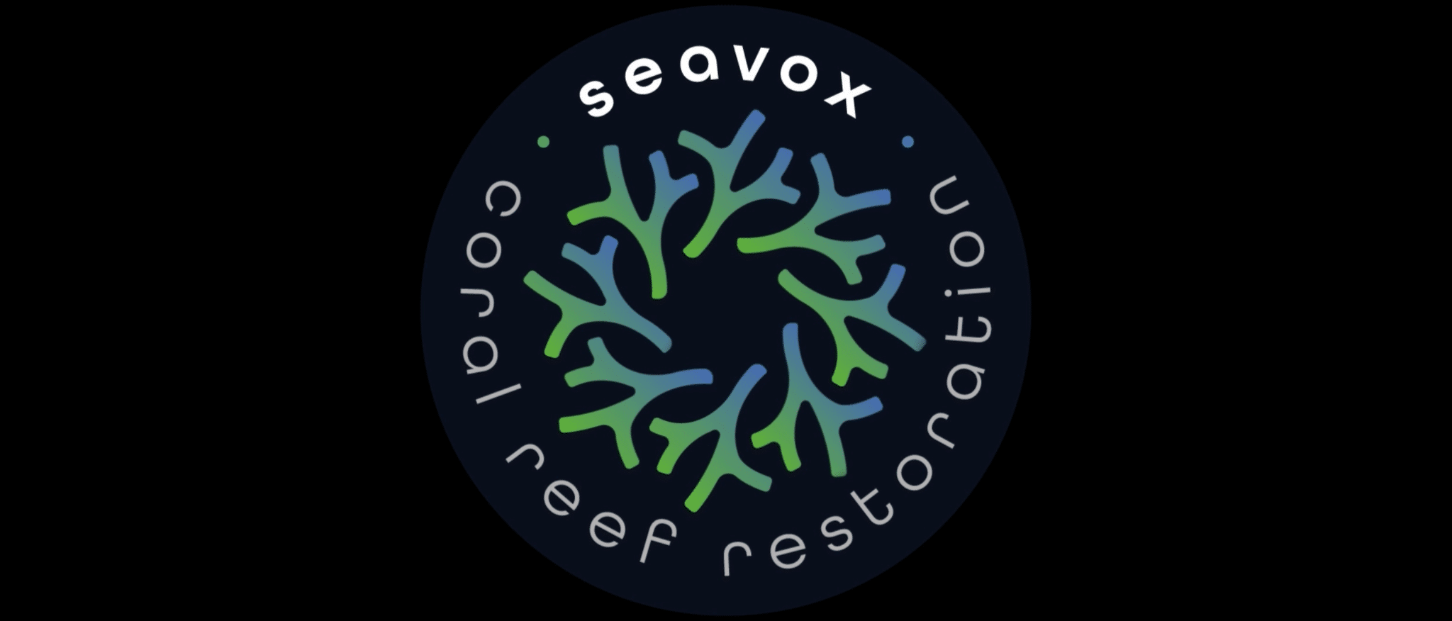
The Seavox logo was designed with purpose in mind, reflecting the interconnectedness and flow of coral ecosystems. Here’s how we used hierarchy to bring it to life:
- Primary focus: the brand name
Positioned at the top, ‘Seavox’ is the first thing you notice. It anchors the logo and ensures immediate brand recognition. - Secondary focus: the coral motif
Inspired by natural reef patterns, the circular form encourages the eye to move around the logo. The flow mirrors the cycles of regeneration Seavox supports. - Tertiary focus: the mission statement
Placed beneath the coral form, the line ‘coral reef restoration’ communicates the brand’s purpose. It’s subtle but powerful – the final destination in the visual journey. - Supporting colours and contrast
Shades of ocean blue and reef green evoke calm, strength, and nature – and help distinguish each element of the logo clearly.
5 Quick Tips for Creating a Strong Hierarchy Logo
If you’re building or refreshing your brand, here are some useful tips to apply logo hierarchy to your design:
- Start with what matters most
Decide what your audience should see first – your name, symbol, or purpose? - Use size and weight wisely
Larger, bolder elements naturally draw more attention. Make sure the most important piece stands out. - Consider the layout flow
Circular or vertical arrangements can help guide the eye in a deliberate way. - Limit your colour palette
Too many colours create visual noise. Use contrast strategically to separate key parts of the logo. - Test across formats
A good hierarchy logo works at all sizes – from business cards to billboards. Test it in black and white, too.
Let’s Build a Logo That Works as Hard as You Do
Your logo should do more than look good – it should work. If you’re ready to build a hierarchy logo that leads the way, take a look at our logo design services here and see how we can help bring clarity and creativity to your brand identity.